Droplet
Branding | Logo design
Client
Droplet is a community-led initiative focused on raising awareness around reproductive health, an area still surrounded by taboos, even in the Netherlands. The project was created to support non-native and Dutch communities in the Leidschendam-Voorburg and The Hague region.
Challenge
Reproductive health can be difficult to talk about, especially within international communities facing language barriers and unfamiliarity with the Dutch healthcare system. Droplet needed a brand identity that felt safe, inclusive, and approachable—one that could open conversations while maintaining a sense of professionalism and care.
Approach
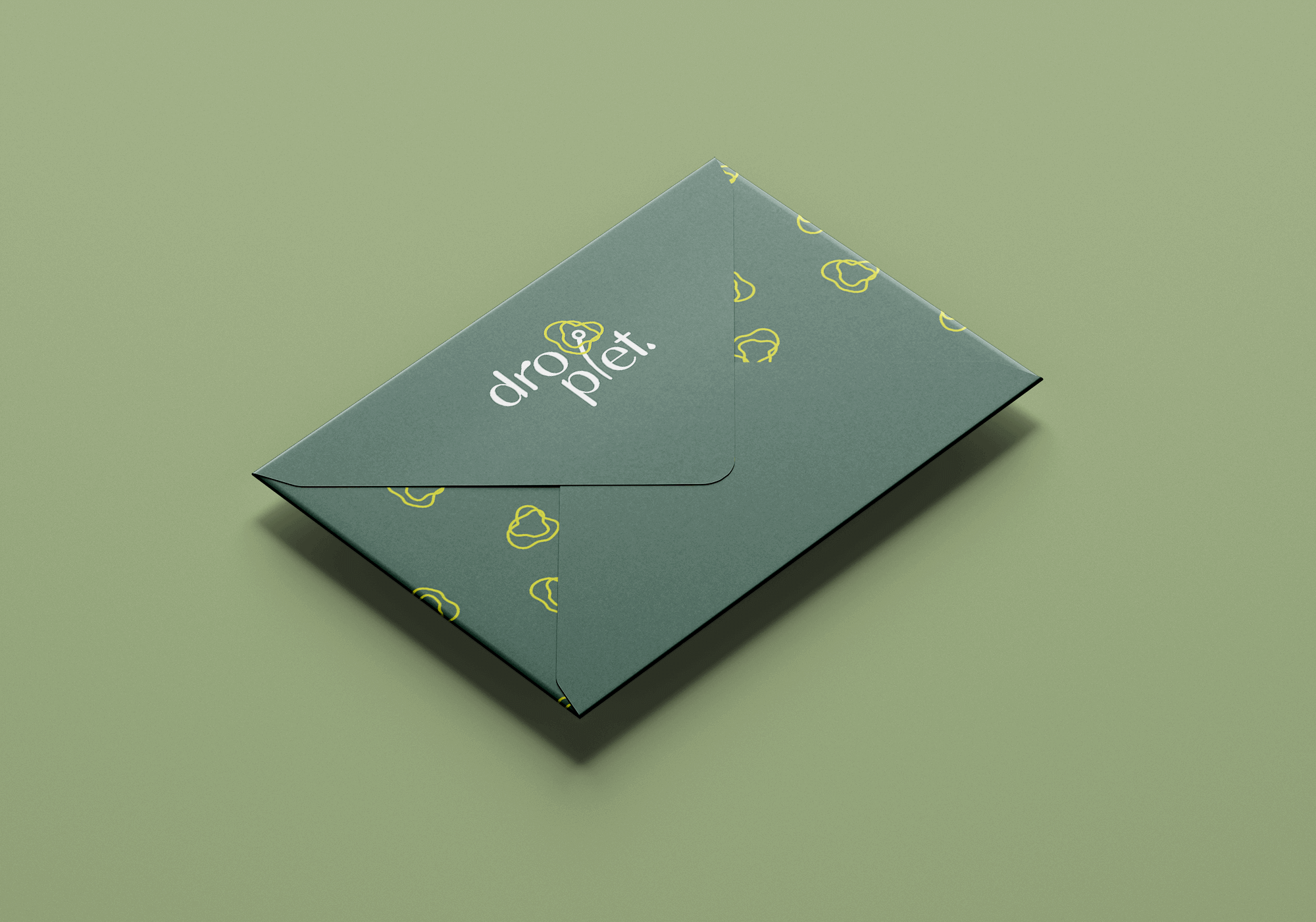
I developed a logo and visual direction that symbolised openness, care, and quiet strength. Inspired by nature and the gentle growth of flowers, the organic lines of the mark suggest a blooming form—while the concentric shapes around the stem reflect the idea of community, support, and ripple effects. The soft colour palette evokes calmness and trust, and the droplet shape ties directly to the name and the theme of health. Typography and layout choices were kept clear, natural and human, balancing warmth with clarity to make the brand feel both welcoming and empowering.
Result
The final branding gave Droplet a distinct, memorable identity—one that communicates sensitivity without shying away from important topics. The logo became a friendly, confident symbol for the initiative, helping to spark conversations and support community events, workshops, and outreach efforts across different cultures and backgrounds.