Never Too Hoppy
Craft beer branding and label design
Client
Never Too Hoppy is a modern craft beer brand known for its bold personality and adventurous flavours. With an experimental approach to brewing, the brand set out to create a visual identity that would match its creative spirit.
Challenge
Never Too Hoppy refuses to stand still. The brand needed a design that captured its playful spirit while maintaining a modern, forward-thinking approach to brewing. While many beer brands lean into illustrative or masculine aesthetics, the goal was to create a brand that dares to break the mould and defy expectations. The challenge was to express a love for hops through boldness, clarity, and charm, resulting in a label that felt fresh, expressive, and impossible to ignore.
Approach
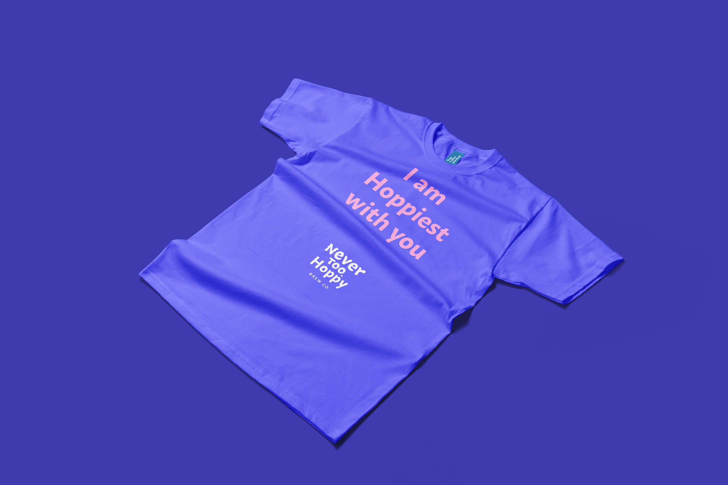
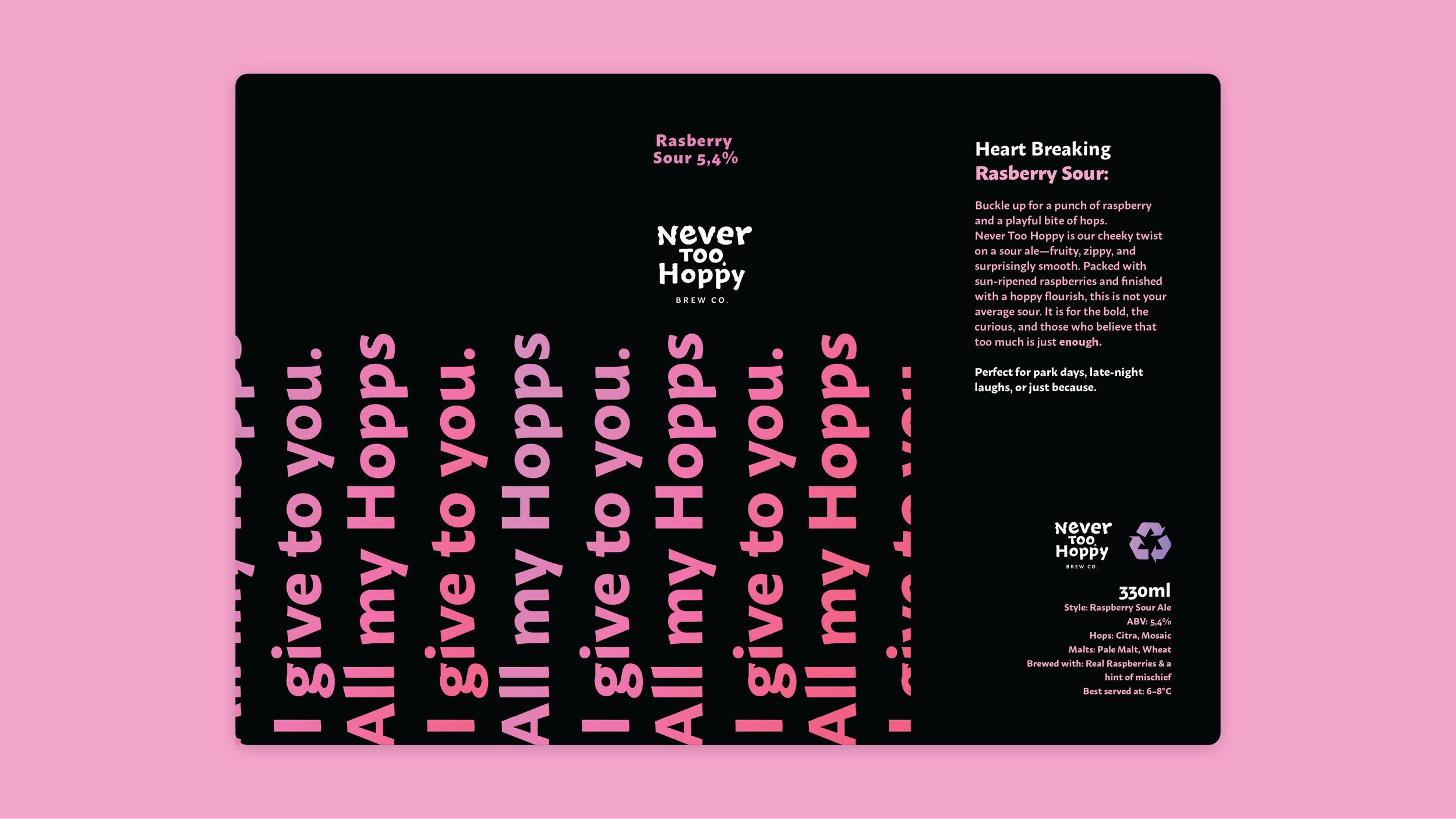
I developed a playful yet refined visual identity centred on bold typography, energetic colour choices, and clever, hop-inspired phrases. The minimal layout allowed the language to take the lead, while the colour palette and type treatments gave the packaging a contemporary edge. The identity was inspired by a love letter to hops—the essential ingredient that makes every beer possible—celebrating its role with both personality and purpose.
Result
The final brand identity feels fresh, memorable, and full of character. It captures the brand’s dedication to experimentation and flavour, offering a confident shelf presence that reflects the heart and soul of what Never Too Hoppy stands for: a celebration of hops in every sip.